Karmacrame Branding Design
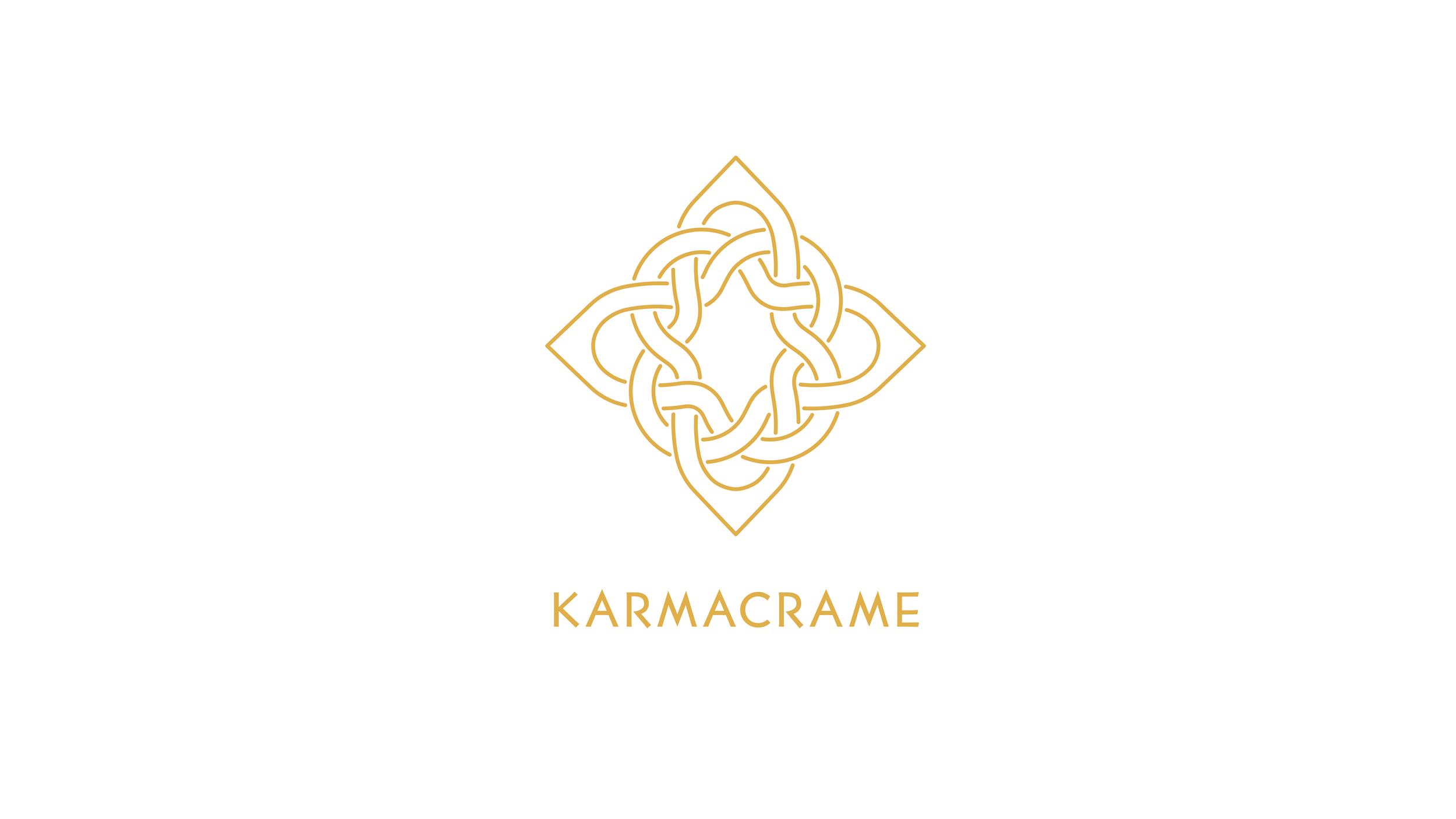
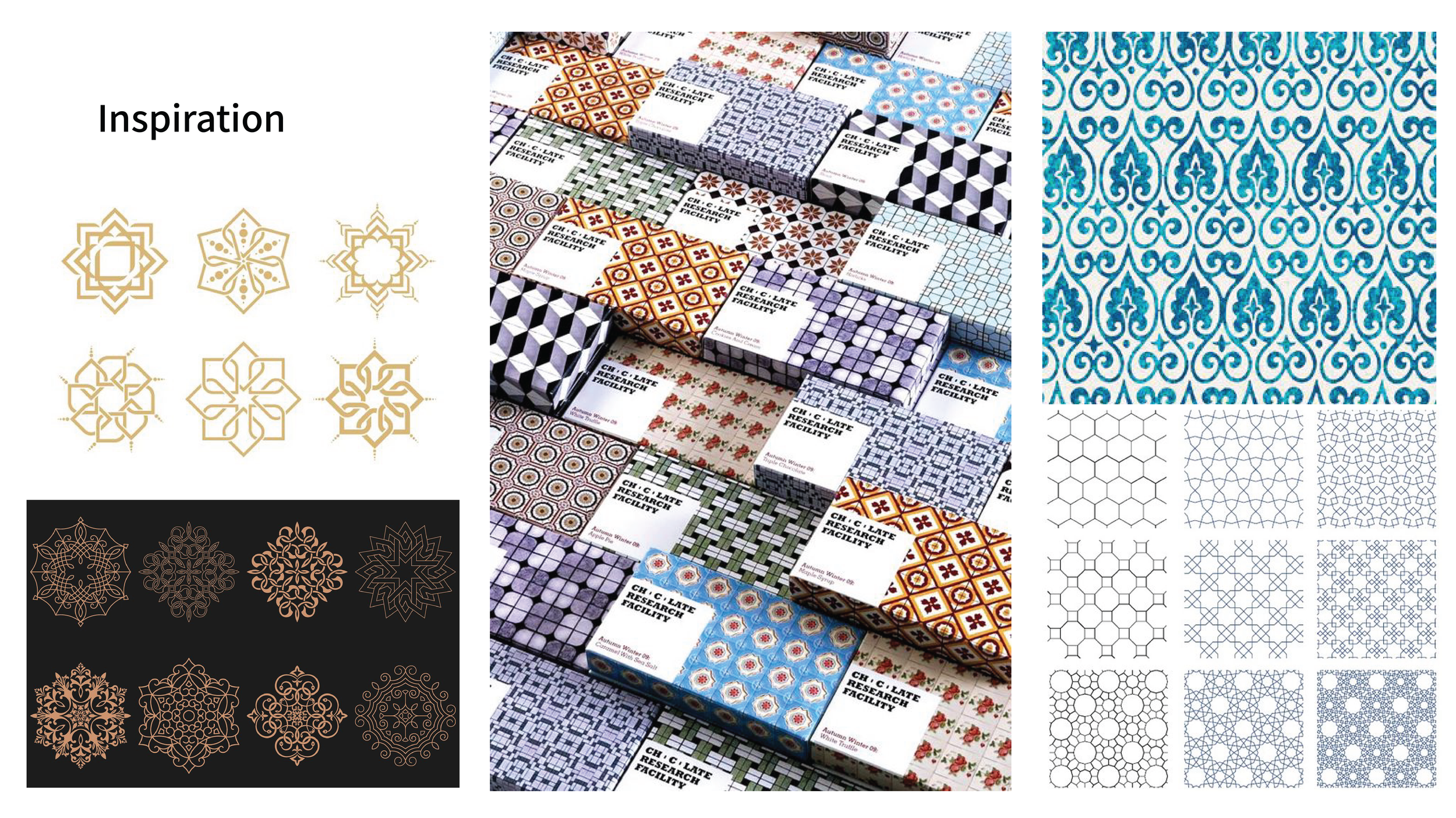
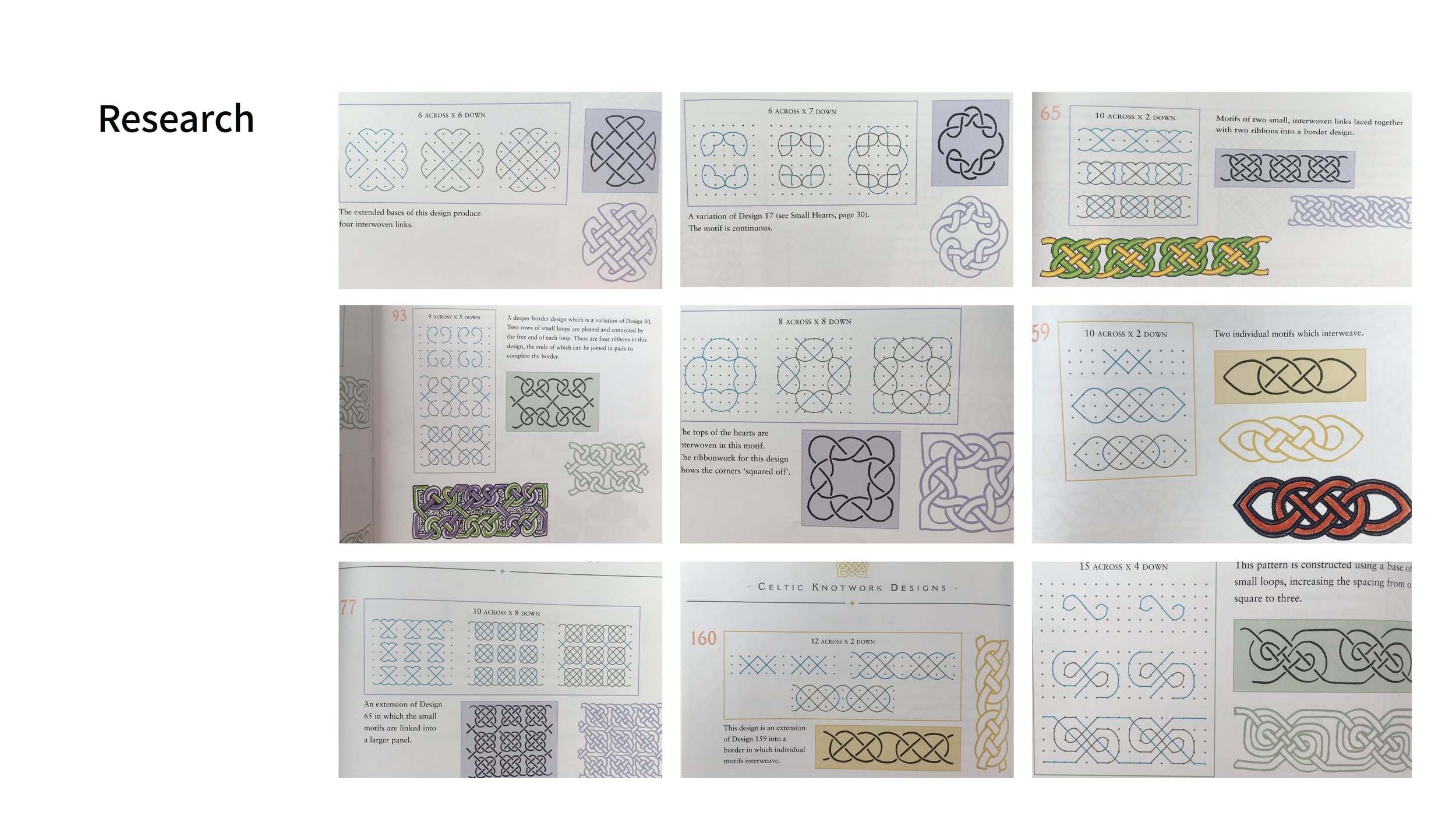
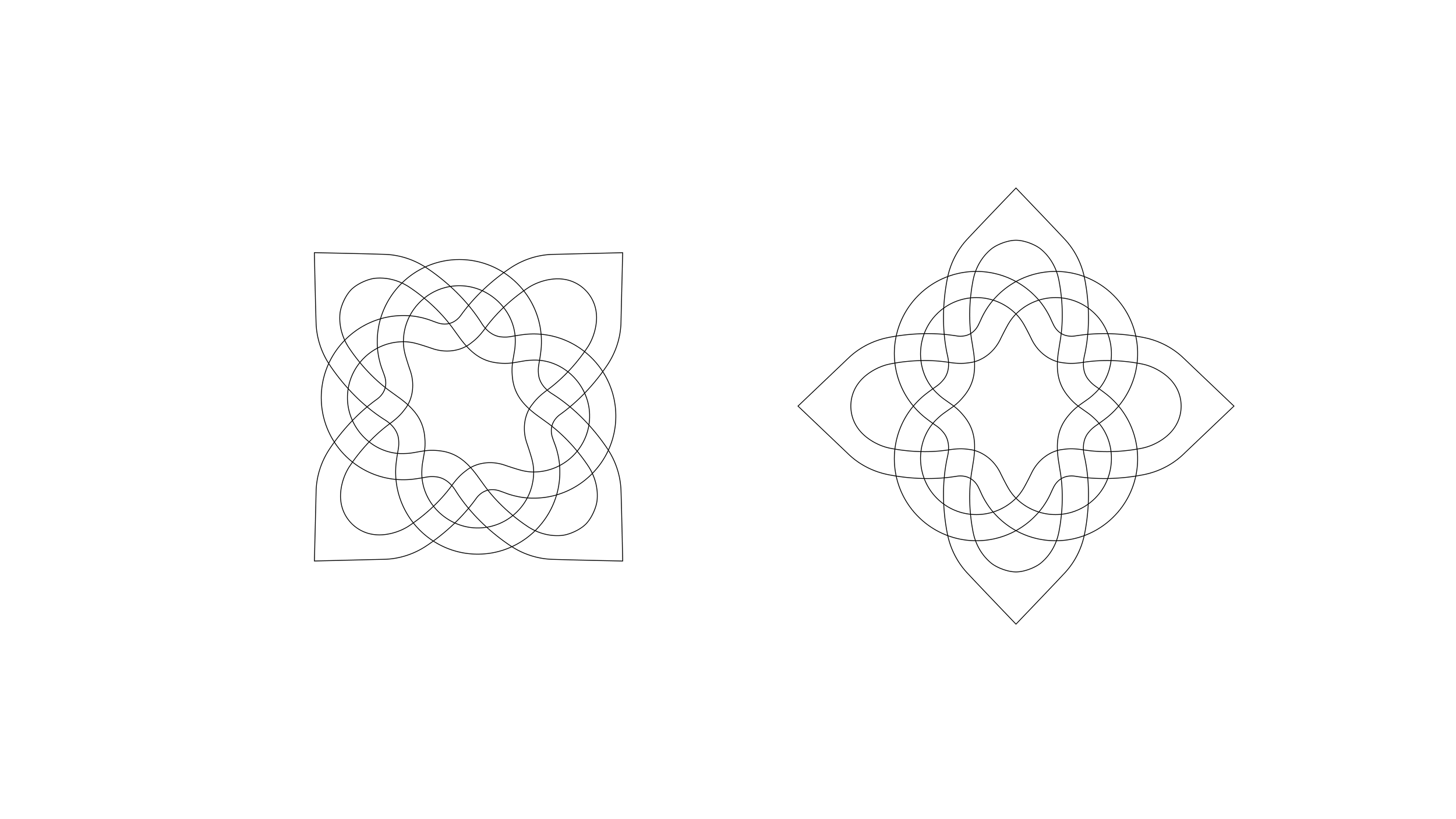
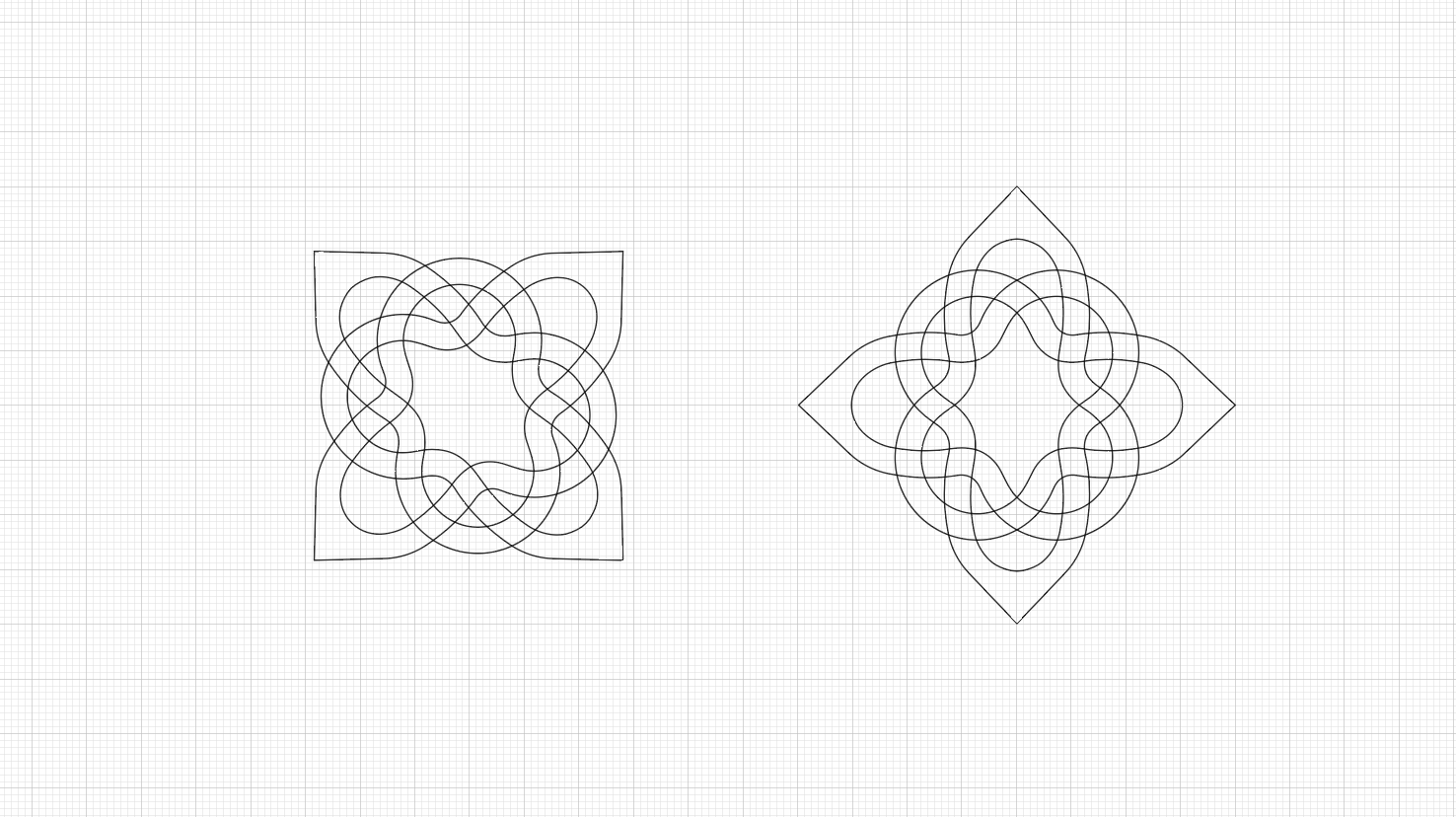
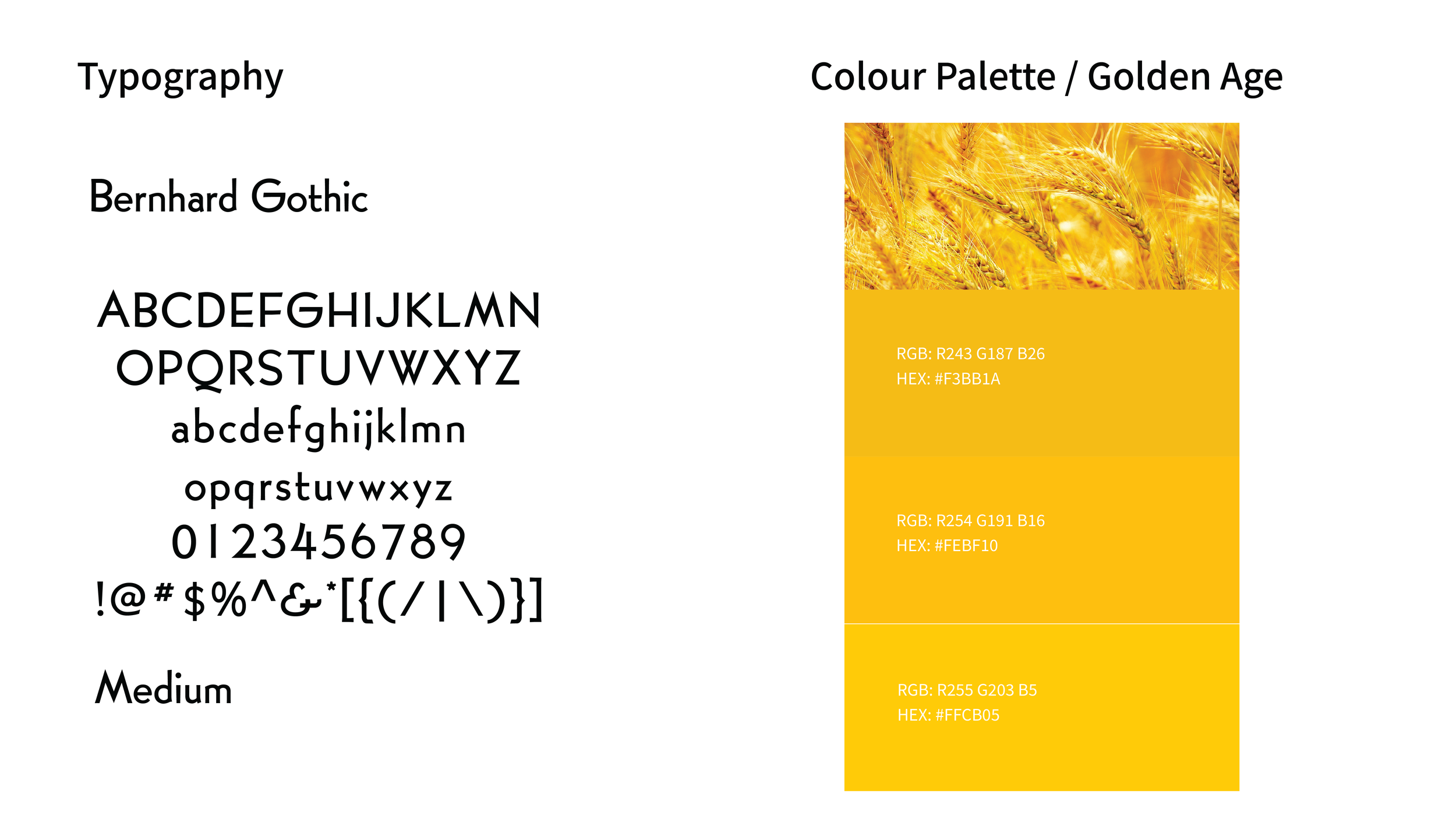
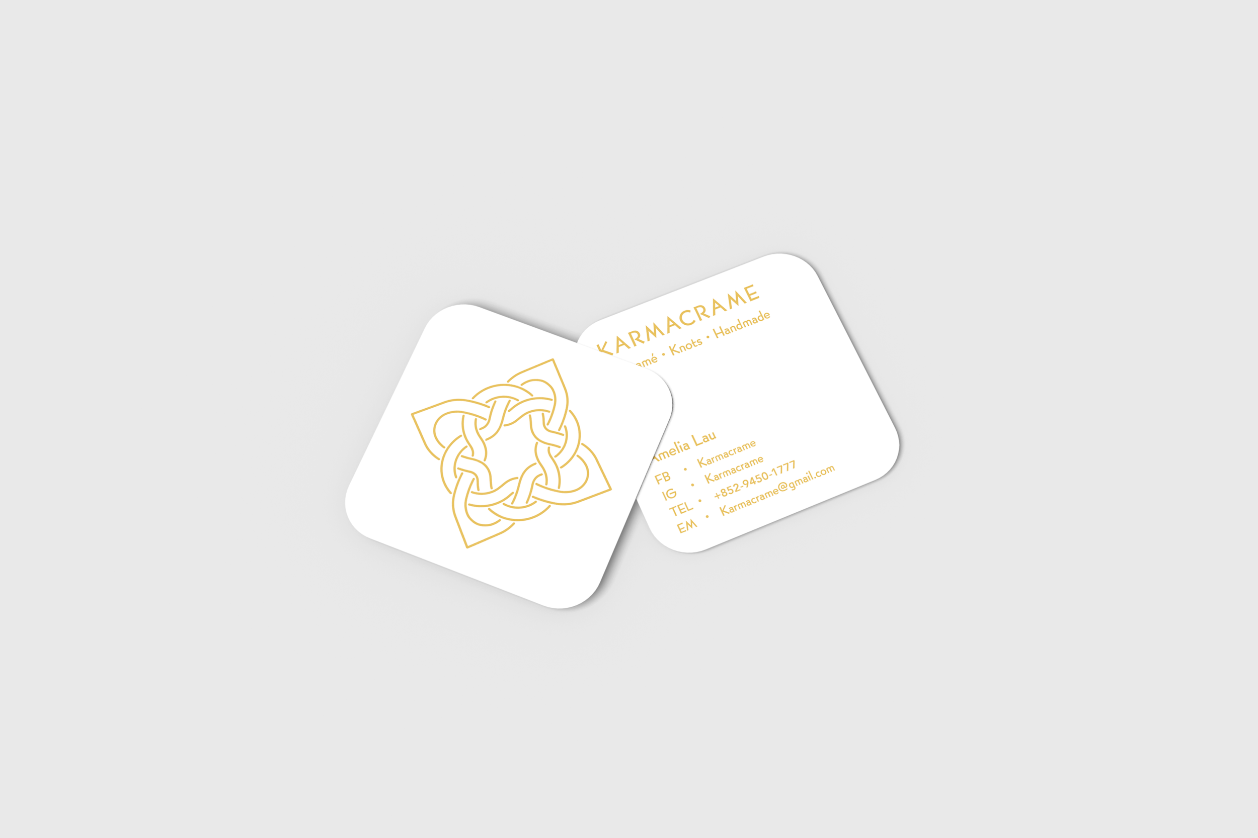
This brand is based on my interest in macramé. In my perspective, karma is like a knot, so I named the company "Karmacrame." "No karma, no love" is a motto from my previous teacher. I believe that if we can perceive karma, we can find love within it. Thus, I used the infinite loop pattern to represent the karma knot. Inspired by the Golden Age, which denotes a period of primordial peace, harmony, stability, and prosperity, I wanted to convey this feeling through my logo. I used a mild golden color as the main colour. For the logotype, I chosed a Vienna Secession-inspired typeface to create the typography. Vienna Secession is an art movement famous for artists like Klimt and its architectural style, which aligns with the idea of the Golden Age. Interested employers are welcome to send me an email to request the Logo Design PDF.
Branding Identity Design | Logo Design
Project by Amelia Lau
Client
Self-initiated project
Year
2018
Website
Karmacrame Instagram
